
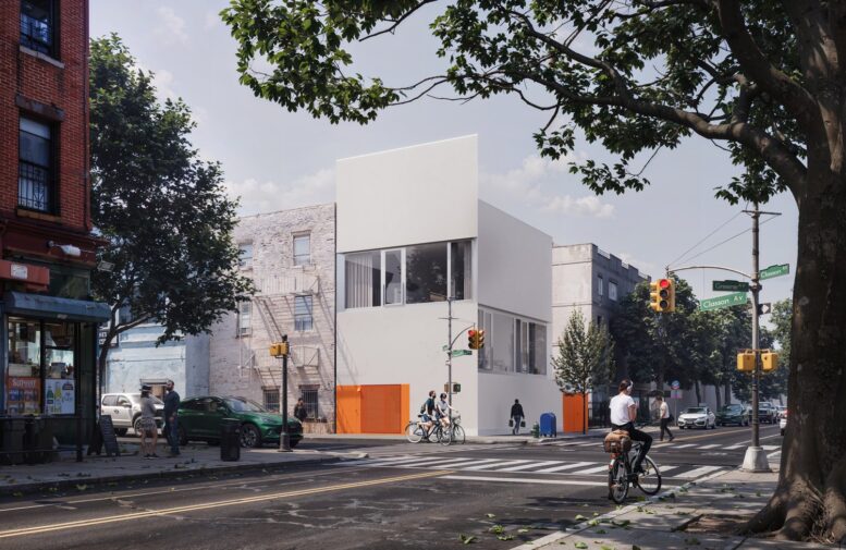
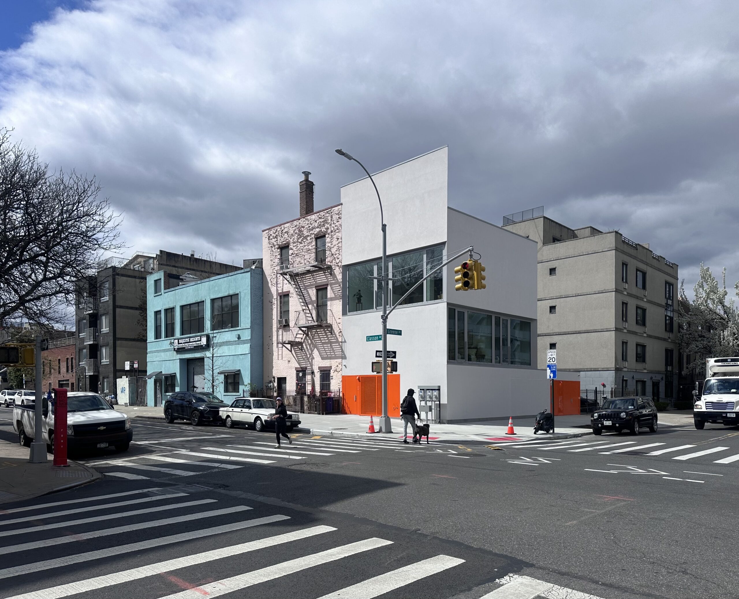
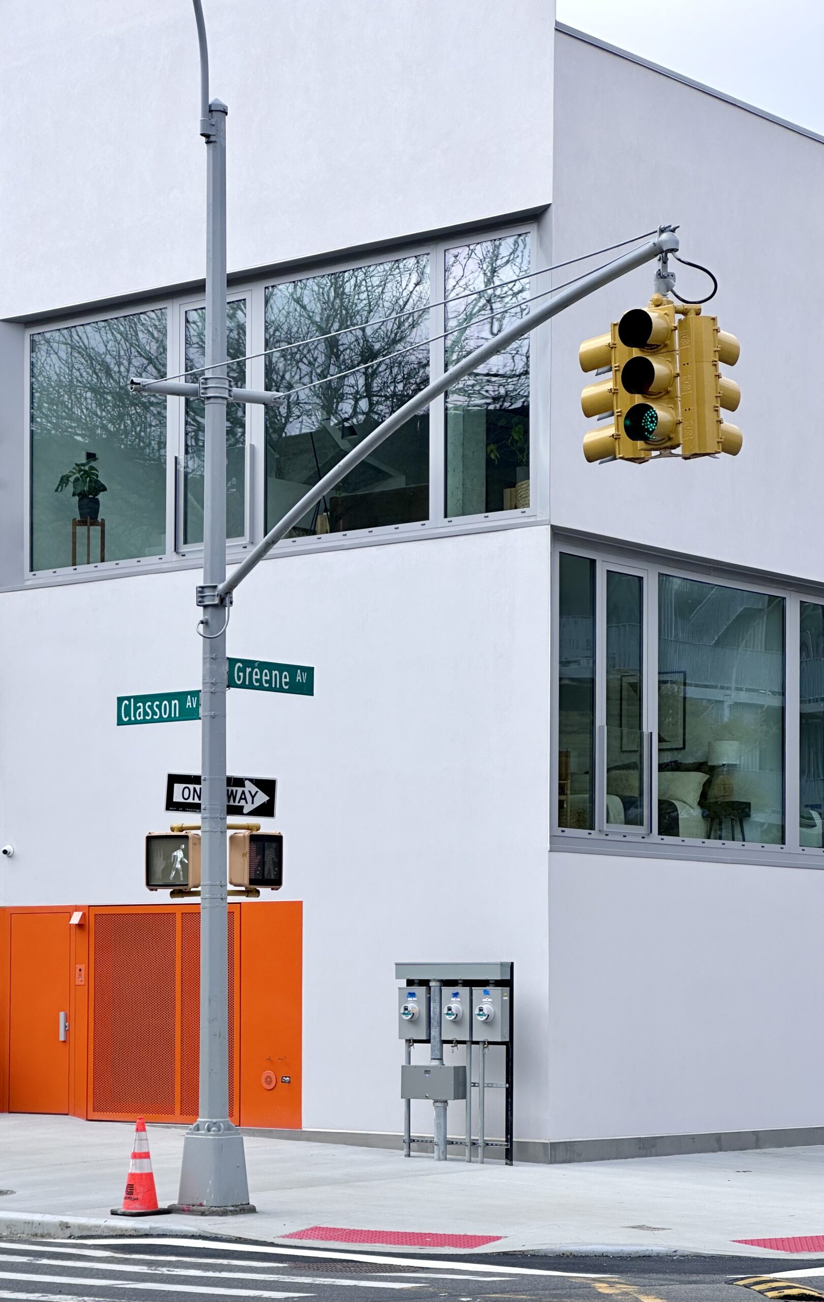
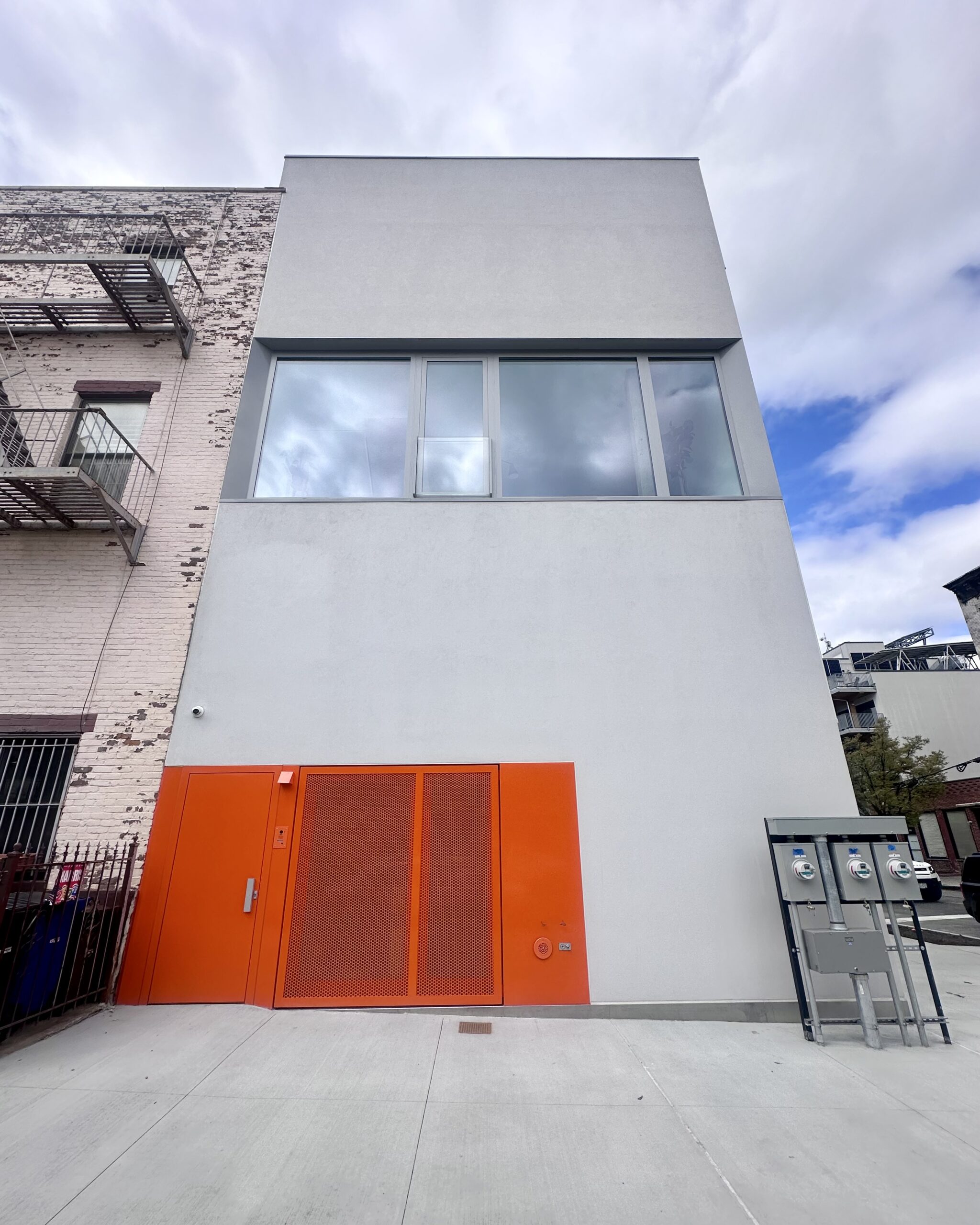
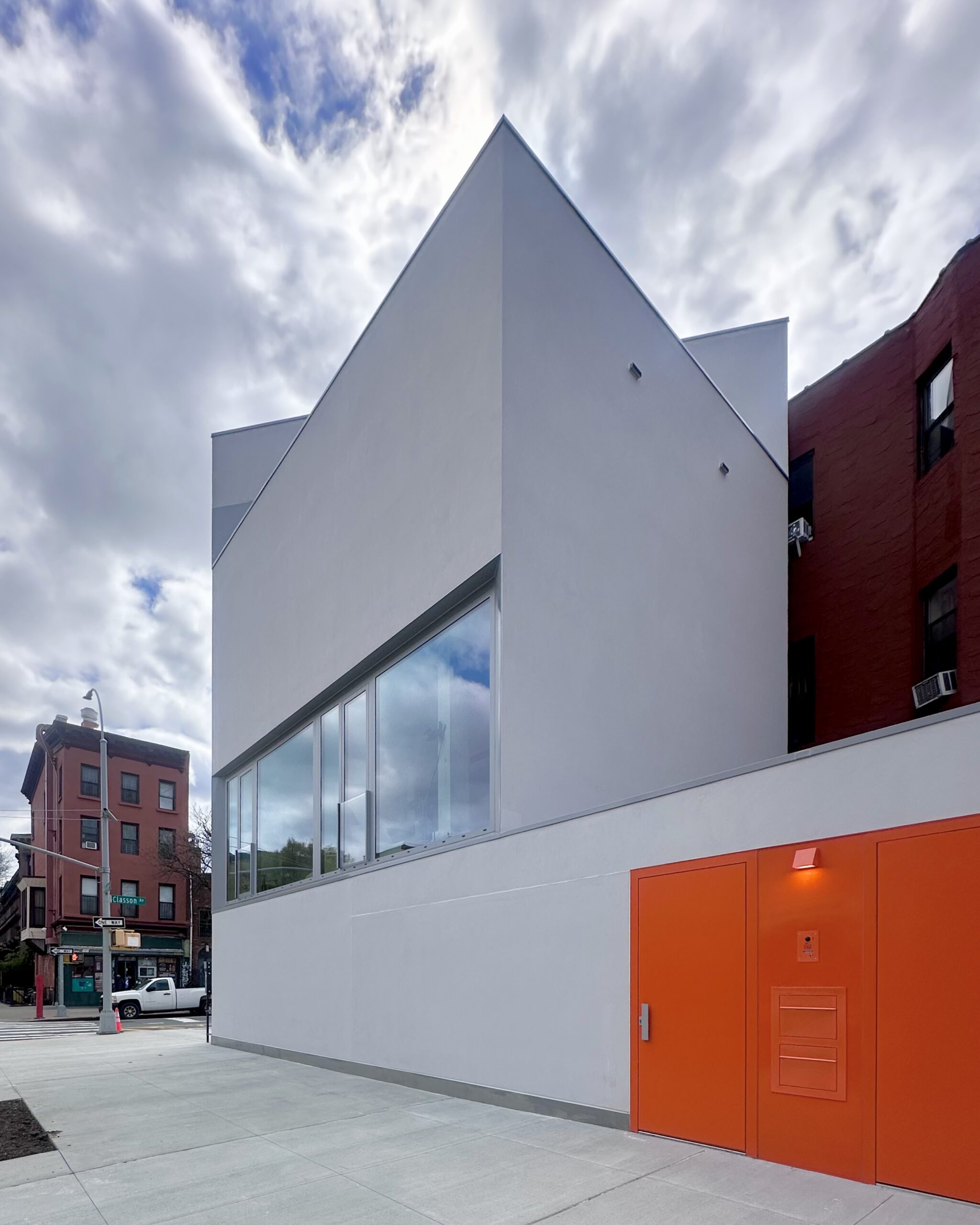
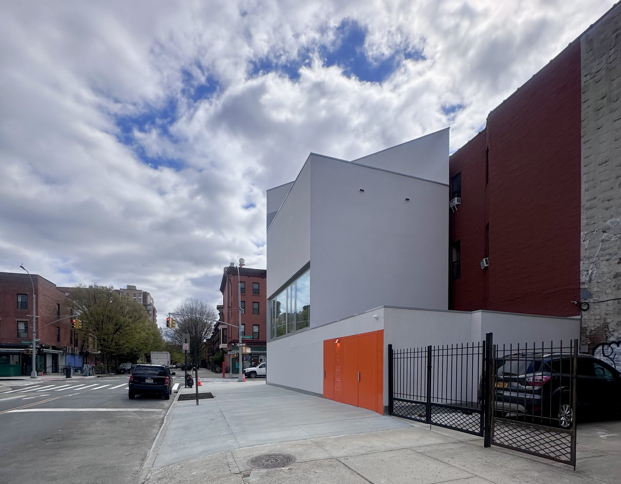
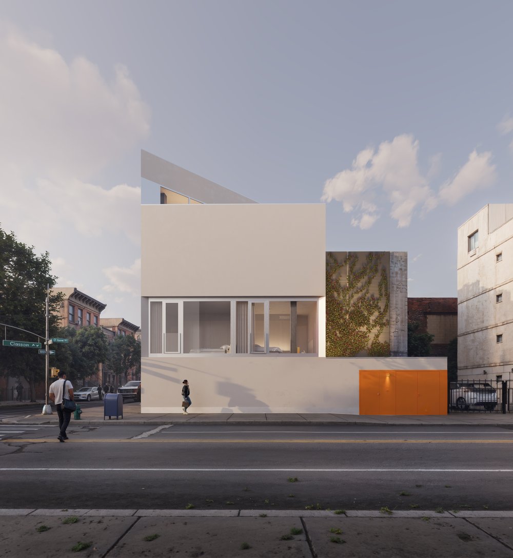
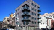
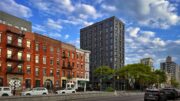
Work is complete on 272 Greene Avenue, a four-story single-family residential building on the eastern edge of Clinton Hill, Brooklyn. Designed by Switzerland-based Inès Lamunière in collaboration with Matthias Müller’s Brooklyn-based MuNYC Architecture, the structure spans 2,700 square feet and includes a rooftop terrace and an off-street parking space. The building stands on a 1,313-square-foot property at the corner of Greene and Classon Avenues.
The structure stands in stark architectural contrast to the surrounding neighborhood with its minimalist design featuring light gray stucco and staggered floor-to-ceiling windows. Further differentiating its appearance are the use of bright orange doors and metal screens, and the sharp diagonal wall of the fourth story, which is best seen from across the intersection, as in the following two photos.
272 Greene Avenue. Photo by Michael Young.

272 Greene Avenue. Photo by Michael Young.
272 Greene Avenue. Photo by Michael Young.
272 Greene Avenue. Photo by Michael Young.
272 Greene Avenue. Photo by Michael Young.
272 Greene Avenue. Photo by Michael Young.
The cellar level contains a private patio, two bedrooms that can be converted into a home office, an in-unit washer and dryer, and a half-bathroom. The ground floor houses a living/dining room, bathroom, and open-air space that looks down at the patio. The second story contains two bedrooms and a bathroom. The third floor has a living/dining room and kitchen plus another bathroom. The triangular fourth story contains a bathroom and an outdoor terrace.
The building’s stairwell is situated against the southern side of the superstructure, which was originally conceived as a two-unit property but was later revised into a singular dwelling.
272 Greene Avenue.
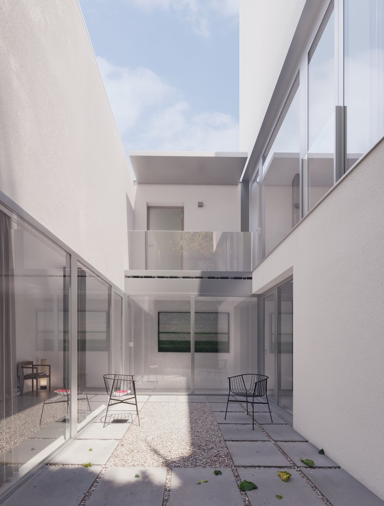
The patio space at 272 Greene Avenue.
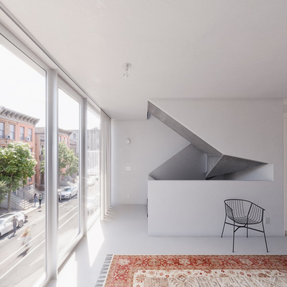
The stairwell on the upper levels of 272 Greene Avenue.
The floor plan below shows the layout of each level.
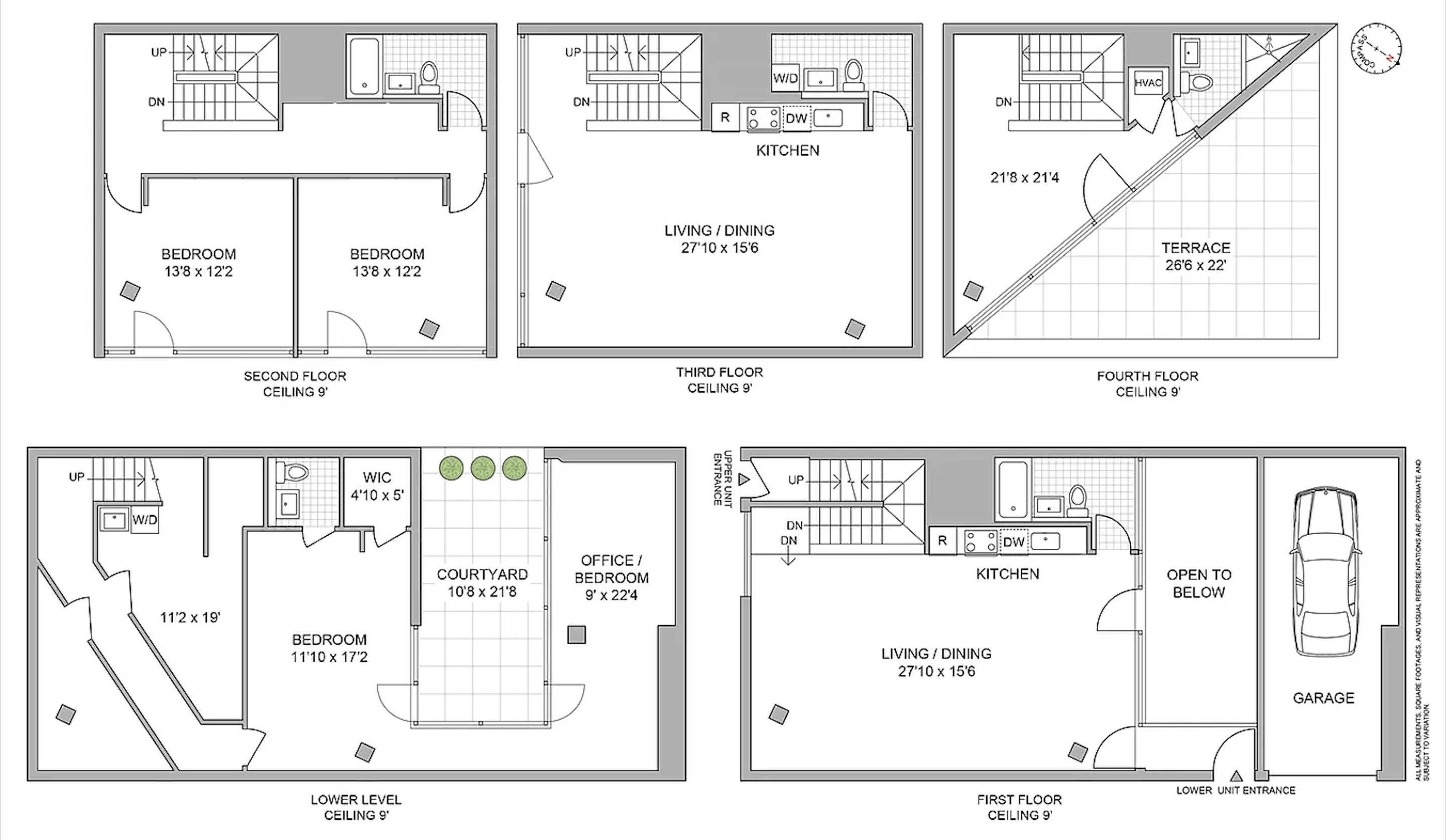
272 Greene Avenue floor plan.
The property was formerly occupied by a vacant one-story structure, as seen in the below Google Street View image from before its demolition.

Pre-demolition 272 Greene Avenue. Credit: PropertyShark
Lucy Perry and Jessica Henson of Compass are in charge of marketing the home. The nearest subway from 272 Greene Street is the G train at the Classon Avenue station to the north.
Subscribe to YIMBY’s daily e-mail
![]()
Follow YIMBYgram for real-time photo updates
Like YIMBY on Facebook
Follow YIMBY’s Twitter for the latest in YIMBYnews
I do not know why the utility meters were put in such an obvious position. ConEd can read indoor meters from passing trucks. I would think vandalism might be a concern. Breaking the seals of the meters can cause difficulties including charges from ConEd.
Highly unlikely anyone messes with the meters. But 3 meters in a SFH?
It’s a 2 unit property. Not sure why YIMBY couldn’t get it right, it has 2 separate entrances.
You’re right. It is a two unit according to city records but why three meters?
3rd meter is probably for common spaces/hallways/exterior lighting
I said the same thing. I’ve seen this place
More of this, New York!
Butt ugly
The outdoor electric meters are TACKY! The design is not great. I think there is a lot of money invested here for no particular purpose.
Can’t believe they were so cheap to put the meters outside…
is there any other to do this ? to hide the meters or make them more atttractive.
or is this just an awful CON Ed requirement ?
Apparently so. “Outdoor metering is required for all new service installations to one, two, and three family detached, semi-detached and row houses.” I was not previously aware of this living in an older building.
White walls make it perfect for taggers. Cleaning up those walls will be a weekly task, My first impression of this property is one of an unfinished design needing details that are absent on the exterior.
This is such unattractive and out of place looking home.
The white walls that will get tagged in no time, the foolish placement of the meters and the usesless courtyard are just a few of the things that just make no sense. What a sterile and despressing building.
Looks like living in a fish bowl.
I am sure they use anti-graffiti paint(yes, there is such a thing) that can wash away graffiti with just water; the meters outside are as required by Con-Ed; the courtyard is extremely useful, and is there so that the lower level can have a bedroom and office legally(as it does now)- otherwise there is no light or air coming into that level. It’s only as ugly as other buildings surrounding it- no more, no less. But at least it’s interesting and a very good use of available space.
I don’t understand YIMBY’s editorial switch a few years ago to promoting small constructions better built in suburbia. A single family home is a waste in NYC and an insult to be built now when housing vacancy is 1.4% and even less in the affordable category. This home is more NIMBY than YIMBY and the new owners will surely oppose any building that houses more than 3 families near them.
YIMBY means density. Its leading publication should reflect that view.
its their land., they can build a house.
what exactly do think a townhouse is? a single family home.
Sure beats the eyesore it replaced.
I think its super cool.
Affordable you mean subsidized by other New York taxpayers.
The sense of entitlement in the town knows no bounds
The word townhouse is usually used in reference to an attached residential building, not specifically a SFH. Almost all townhouses in NYC have two or more units.
The lot and location call for a single family home, but I prefer the eyesore it replaced.
Because this site accounts for ALL things that fall under the YIMBY acronym, which includes small developments like this residence. Why turn a blind eye to such developments, even if it’s not as big as a skyscraper that most people associate with the term YIMBY?
Be quiet and let the writers and photographers do their work Scott
I don’t think there’s promotion of small construction here at all. They are just covering what is being built. Almost all of which is multi-unit.
What an idiotic comment. Really utterly brainless. If someone has the money to buy a plot of land anywhere in the city and wants to build themselves a single-family home, then it is their right to do that. Of course it doesn’t happen a lot, because economically it makes more sense for developers to build multi-unit dwellings (and this was at one point conceived to be a two-unit house). But neither you nor any law on the books can force someone to build more than one dwelling unit on this kind of tiny parcel, nor should that ever happen. Also like it or not, this is a lot more interesting than 99% of cookie-cutter rental buildings (and (I am a neighbor and see this thing every day). The real problem is that a lot of 8 story buildings going up around the city should be 12-15 stories or taller.
Scott, this is a construction & development website tracking various projects at different scales. Why should newyorkyimby.com only limit themselves to projects that are tall buildings or projects that get more hype than the example above? Just because it’s small and nondescript (so to speak) doesn’t mean it shouldn’t be ignored
I like the design, but the interior layout isn’t very efficient. The white wall will need a thick anti-graffiti coating so the spray paint can be washed off weekly.
And yes, the power meters floating on the corner ruins everything. It’s unforgivable.
It looks like it should be a maintenance building for the MTA. Talk about December in July……
No thanks
This one has been very controversial in the area. It’s a very desirable corner and should be 10 apartments.
I remember when the rendering was first posted and thinking, “That can’t possibly be the final design.” Welp… Here we are. It’s such a head-scratcher — not dense enough for the location, and so outlandish I can’t imagine it holding its value. It’s an architect’s fantasy with zero pragmatism.
Someone needs to get the architect some anti-depressants, this is such a sad design? The first floor apartment has no outside views.
I think it is two apartments not single family. There are three meters.
Saw someone making fun of this spot on tiktok a few days ago. This will be the object of scorn from locals and provides a blank canvas for some good old fashioned graffiti.
The whole nimby and yimby groups could agree a brick building with commercial space on the ground floor with 2-3 apartments on top would have been ideal.
I have friends who live by this new building, and they have been telling me how unhappy a lot of the locals in the neighborhood are with the way this modernist building sticks out like a sore thumb on this prime corner in Clinton Hill. People obviously have the right to build what they want, but I do wish developers were more open to choosing materials that “blend in” better with the surroundings, even if the design itself is modern.
The bright orange feels a bit too loud and overwhelming more fitting for a school than this setting. A more neutral, earth-toned palette would create a calmer and more sophisticated look. Incorporating climbing vines could soften the overall appearance and add some natural charm. Some modern flower pots would also go a long way in enhancing the visual appeal.
The second floor bedrooms – with floor to ceiling windows – are fully visible from the diners at Speedy Romeo across the street. The house just looks painful to live in.
This building is an abomination. I love modern architecture, but the design and layout of this building is horrendous. A below-grade “courtyard” that will never get any light? A garage that most cars can’t even fit in, with no deck or any structure on top? Full wall windows to look out onto the traffic from your bedroom? A triangular bisected top floor (with a ridiculous triangular shower), and an angled hallway on the ground floor? All of this amounts to tons of valuable wasted space, terrible design, and poor construction. The orange doors and meters are just icing on a hideous monstrosity. I’ve lived just down the street facing Classon for over 20 years, and it’s so sad that developers in our neighborhood seem incapable of building anything but eyesores.
Beautiful, spare, functional, efficient, timeless. More of this style of architecture is needed, either single-family or multi-family. Why is the US so averse to modern houses?
Very smart looking