
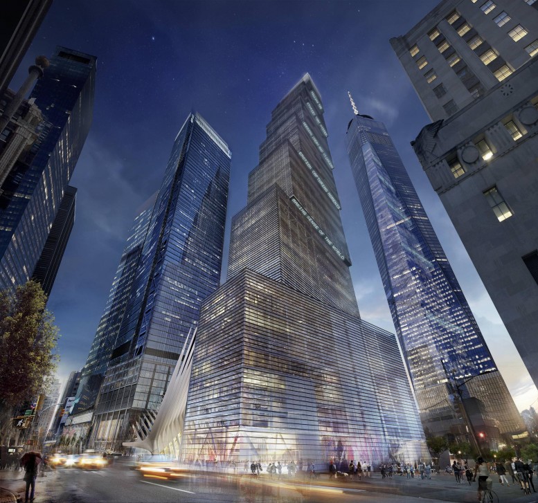
Wired revealed renderings earlier today of Bjarke Ingels’ fantastic vision for 2 World Trade Center, also known as 200 Greenwich Street.
Last week, News Corp. and 21st Century Fox signed a letter of intent to lease 1.3 million square feet at Silverstein’s 2 World Trade Center, in the Financial District, which would warrant the building’s redesign by BIG and eventual construction.
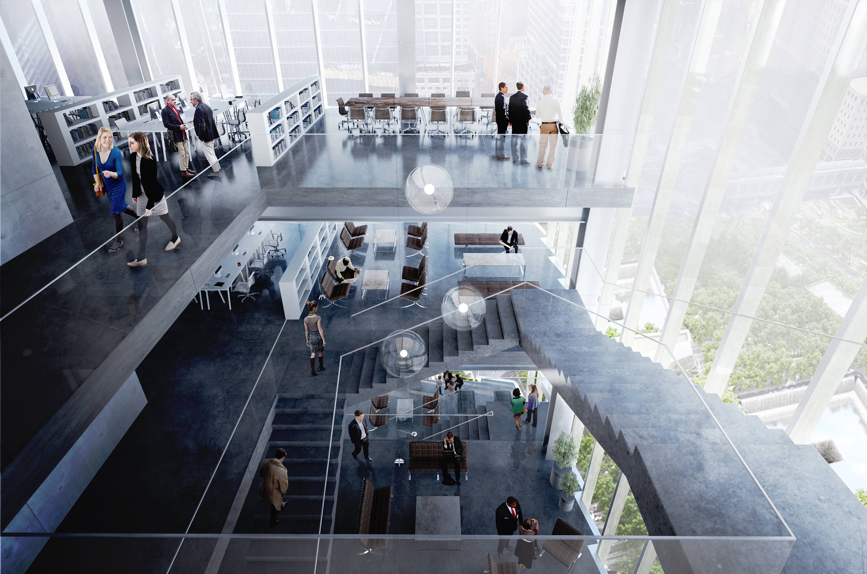
2 World Trade Center, rendering by BIG
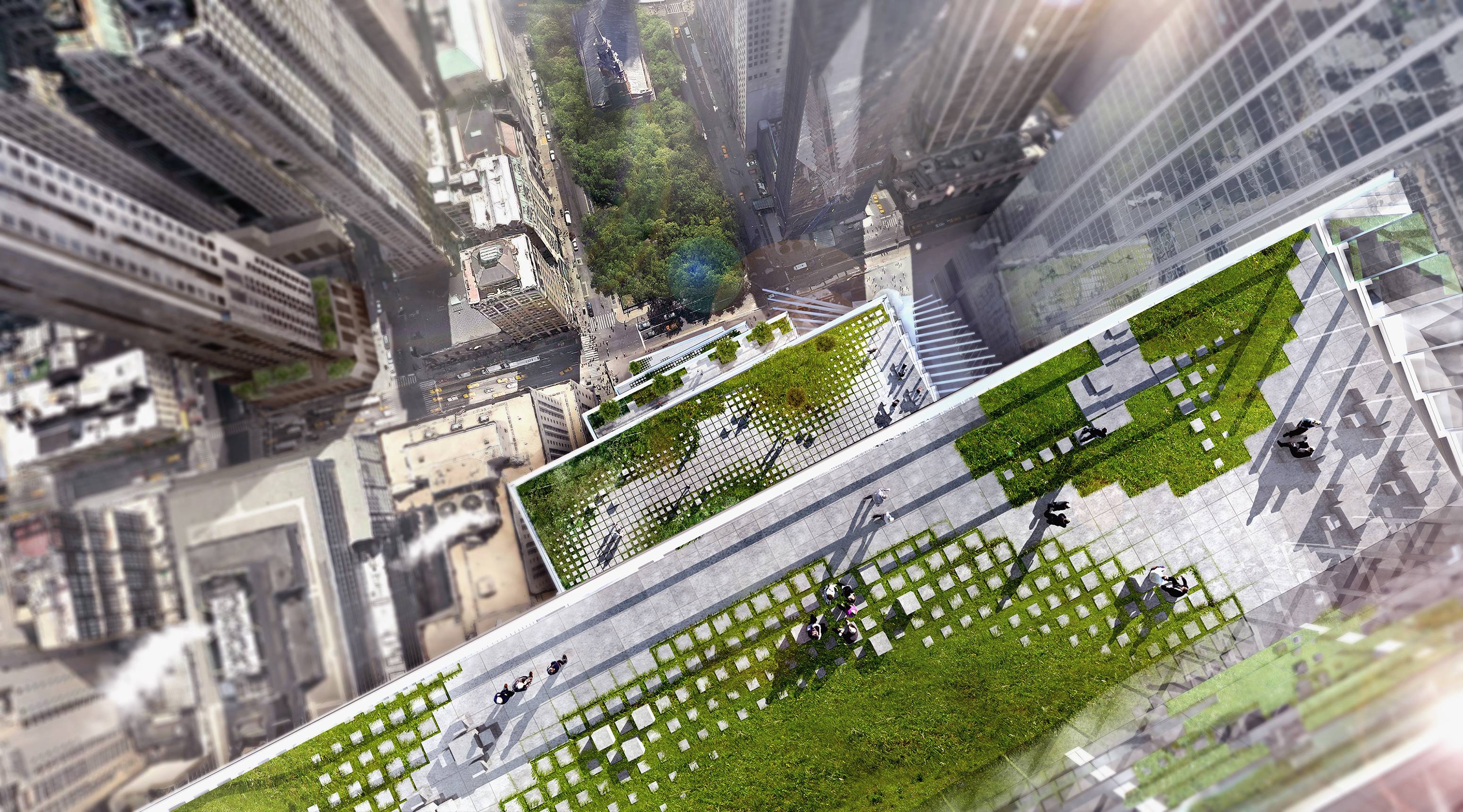
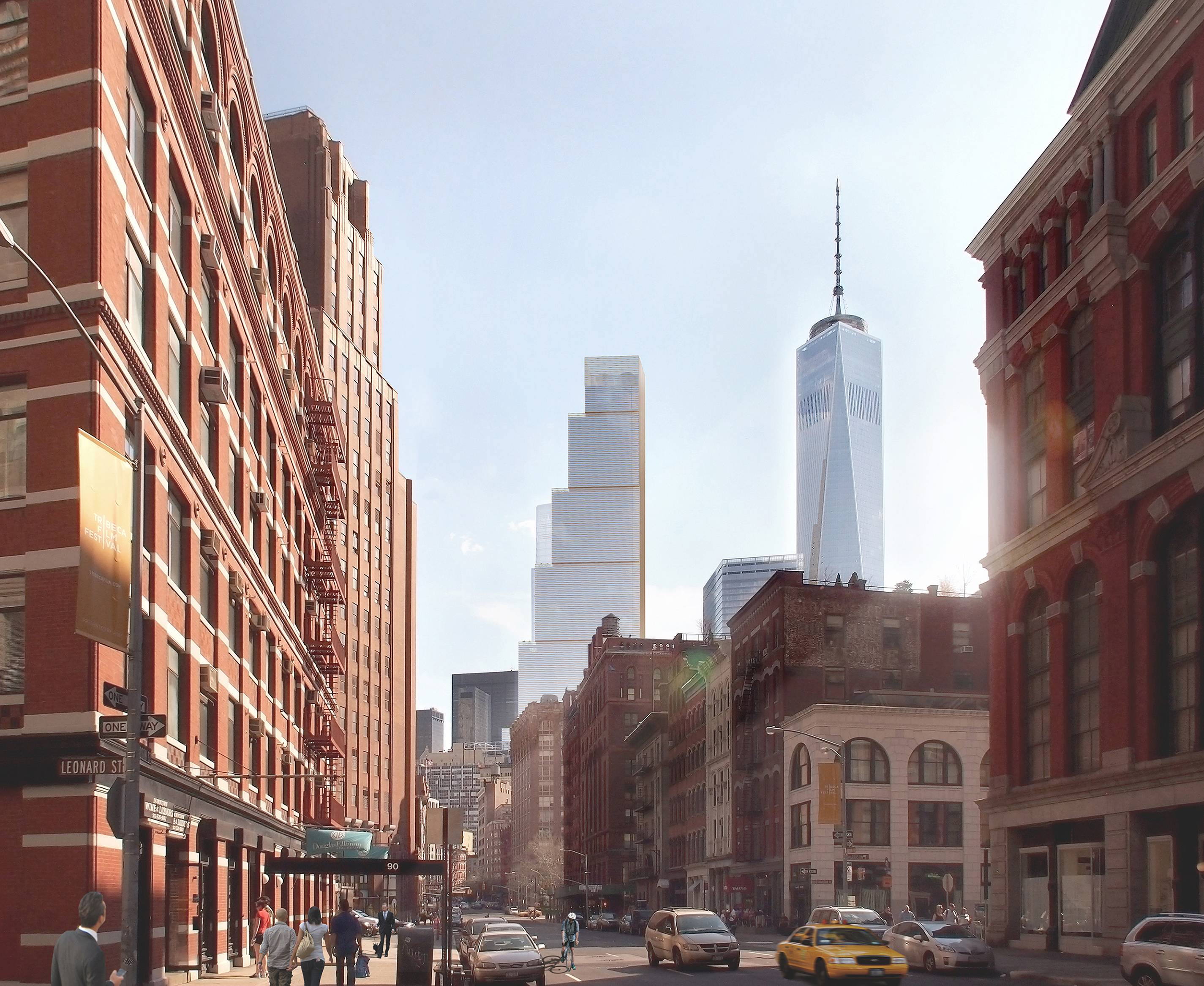
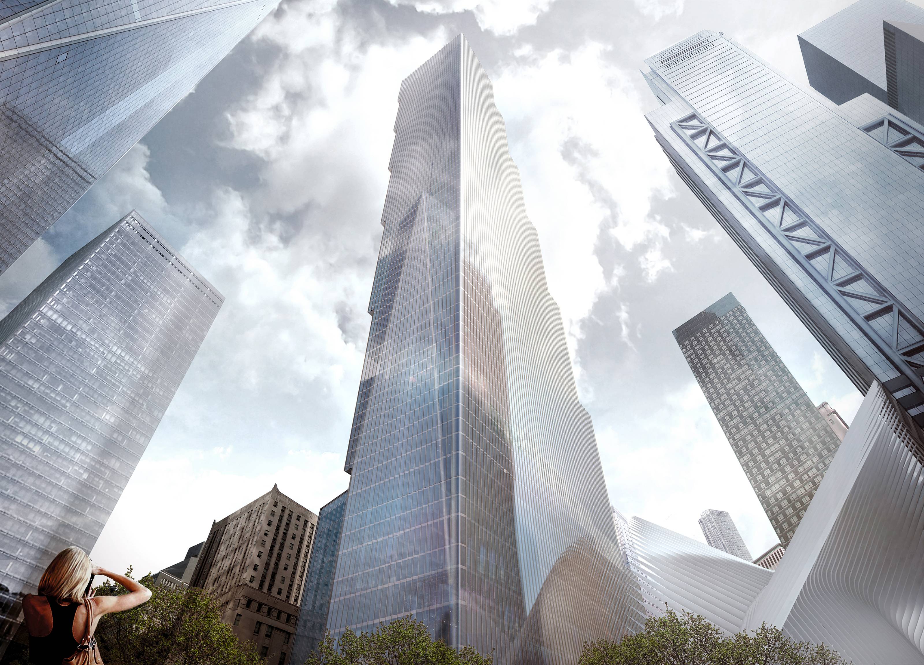
Viewed from the north and east, the building is a stack of seven boxes irregularly placed atop each other, but vertically flush when viewed at the WTC memorial to the southwest. Rising roughly 80 stories, 2 World Trade will top out at 1,340 feet and contain 2.8 million square feet of office space, as architect Norman Foster initially proposed.
2 World Trade Center, rendering by BIG
The office tower is scheduled to be complete by 2021, and is currently build up to grade. The tower should rise along with 3 World Trade Center, another 80-story, 1,170-foot-tall office tower under construction to the south. 3 WTC is scheduled to open in 2018.
2 World Trade Center, rendering by BIG
2 World Trade Center, rendering by BIG
Subscribe to YIMBY’s daily e-mail
![]()
Follow YIMBYgram for real-time photo updates
Like YIMBY on Facebook
Follow YIMBY’s Twitter for the latest in YIMBYnews


In my opinion the former, Norman Forster’s, diamond shaped project is FAR better.
A pity it did not find any tenants in so many years.
RGDS
Luiz Fernando
(Brazil)
Not to take anything away from Ingels who is undoubtedly a great architect and designer, but Foster’s original proposal was ICONIC. Its the type of building that New York needs as opposed to slim pencil skyscrapers. The Character of the proposal was phenomenal. It is making me cringe looking at the boxy glass design of Ingels when Foster’s project was far better
As member of the very small club who didn’t really care for Foster’s design. The four angled squares at the top looked deformed and the shaft was boring reflective skin.
Using the existing foundation was an extremely limiting factor but Ingels’ new design is far more interesting. It is perhaps fitting that Fox News studio windows will forever overlook Ground Zero Plaza.
The original design was perfect! This looks totally out of place now
With all due respect to Mr. Ingels, as a lifelong New Yorker I’m tired of seeing 3rd rate, post modernist architecture assaulting the legendary skyline of the city I dearly love. Seeing this monstrosity assaulting the skyline next to classics such as Woolworth Building, 40 Wall, and 80 Pine, etc. Seeing what looks like a stack of lego blocks is rather uninspiring contrasting with the previous Foster design. I must say it’s totally out of character and proportion to this classic skyline. It’s my hope Fox News and Mr. Ingels come up with a more inspiring design befitting of this great city!
I don’t know what water most of you are all drinking from, but it sounds like the same psychos who want to keep “shawdows” out of Central Park. If you don’t like “shadows” move to Death Valley. The “Ingles” design is far more better than that boring simple minded Fosters design .